Design & Nature Reimagined: Understanding the un-understandable
I talk about climate change with most people I meet. I’m interested to see what their concept of climate change is. What their experiences have been so far, and what they’re worried about for the future. One of the (many) things that makes climate change so hard is the inability to truly understand it. If we don’t understand it, it makes it hard to push for change. So, today I want to talk about climate modeling and visualization. How might we use these tools to better understand the challenge that we all face?
Learn how to read graphs
I love data visualization and talking about graphs. I guess it’s the researcher in me. I particularly love this framework because it’s easy to understand and gives you a way to think about what the story these graphs are trying to tell you; whether you’re looking at them yourself, or discussing them with someone else. This framework is easy, too! 1. What do you notice? What interesting things do you notice about the graph?
-
What do you wonder? Based on what you see, what other questions do you have?
-
What do you think is going on with this graph? What story is the graph trying to tell you?
Temperature visualization
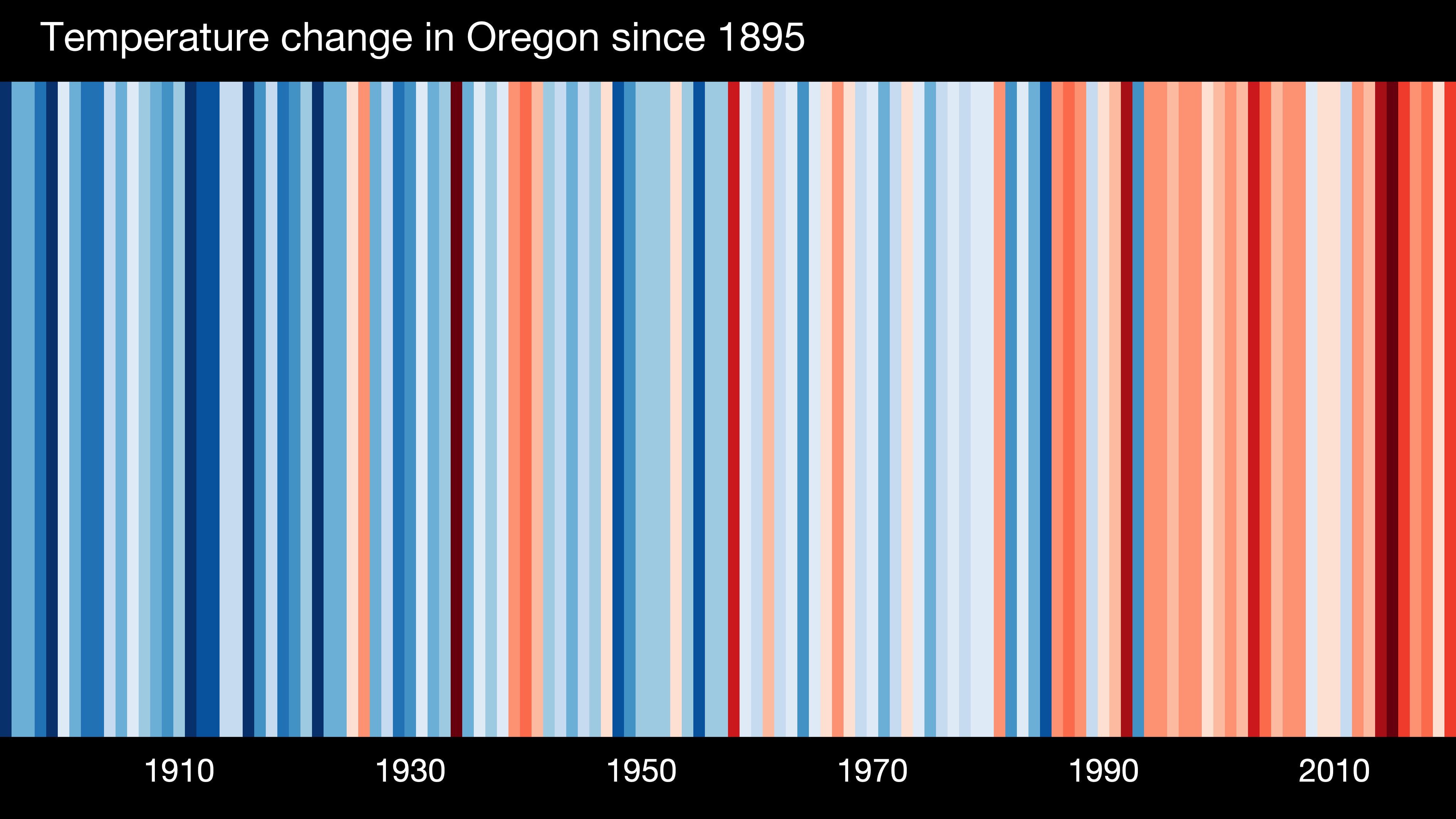
Local weather changes are probably the easiest for us to grasp because it’s something we all have familiarity with. We know when it’s hot and we know when it’s cold. And living somewhere gives us a benchmark to know what it feels like on a day to day or year to year basis. So, it’s really helpful for us to see climate in relation to our own areas, like these graphs mapping temperature rise in Oregon.
Expanding out from this we have Ed Hawkins climate stripes, which you may have already seen. In my opinion, this is probably the best climate visualization because it combines science and art. When you look at it you can immediately grasp the severity of the issue, and it also evokes a strong emotional response.
NASA has the visualization goods
This is a great area on the NASA site called the Science Visualization Studio that shows all sorts of visualizations from temperature rise to temperature variations to moon phases.
They also have a site specifically dedicated to climate change which is great. I’m going to preface this by saying don’t look at this graph if you’re feeling anxious or worried. I’m not being hyperbolic, the graph I linked to is scary. But, on a day when you’re feeling inquisitive, you should look at it and see how CO2 has increased over time. This climate site also shows graphs mapping historical ice recession, sea level projections, and historical global temperature changes.
Climate justice is needed to address climate change
We can’t talk about addressing climate change without addressing climate justice and climate colonialism.
The first article shows a visualization about how the biggest CO2 emitters impact the most vulnerable countries. This second article talks about how much each country emits, how each country’s climate commitments measures up against the Paris Agreement pledge to keep warming below 1.5 degrees Celsius, and how fair those commitments are in a holistic view of global emissions.
That’s all I got for you today folks. You might be wondering why this newsletter is hopeful. Especially since I just showed you a bunch of terrifying graphs. But, I do think this is hopeful because it means people are trying. They’re trying to create a shared understanding through these visualizations. By creating a shared understanding we have a better chance of pushing for the systemic change we need to save ourselves. It doesn’t take a village. It takes a planet.